LewisCleveland.uk
Apparently the website needed a page about building the website. We're through the looking glass now.
- PROJECT ID
- PROJECT_010
- STATUS
- ACTIVE
- CATEGORY
- Web / Design / Writing
- START
- —
- LAST UPDATED
- 18.09.26
- LIVE SITE
- lewiscleveland.uk
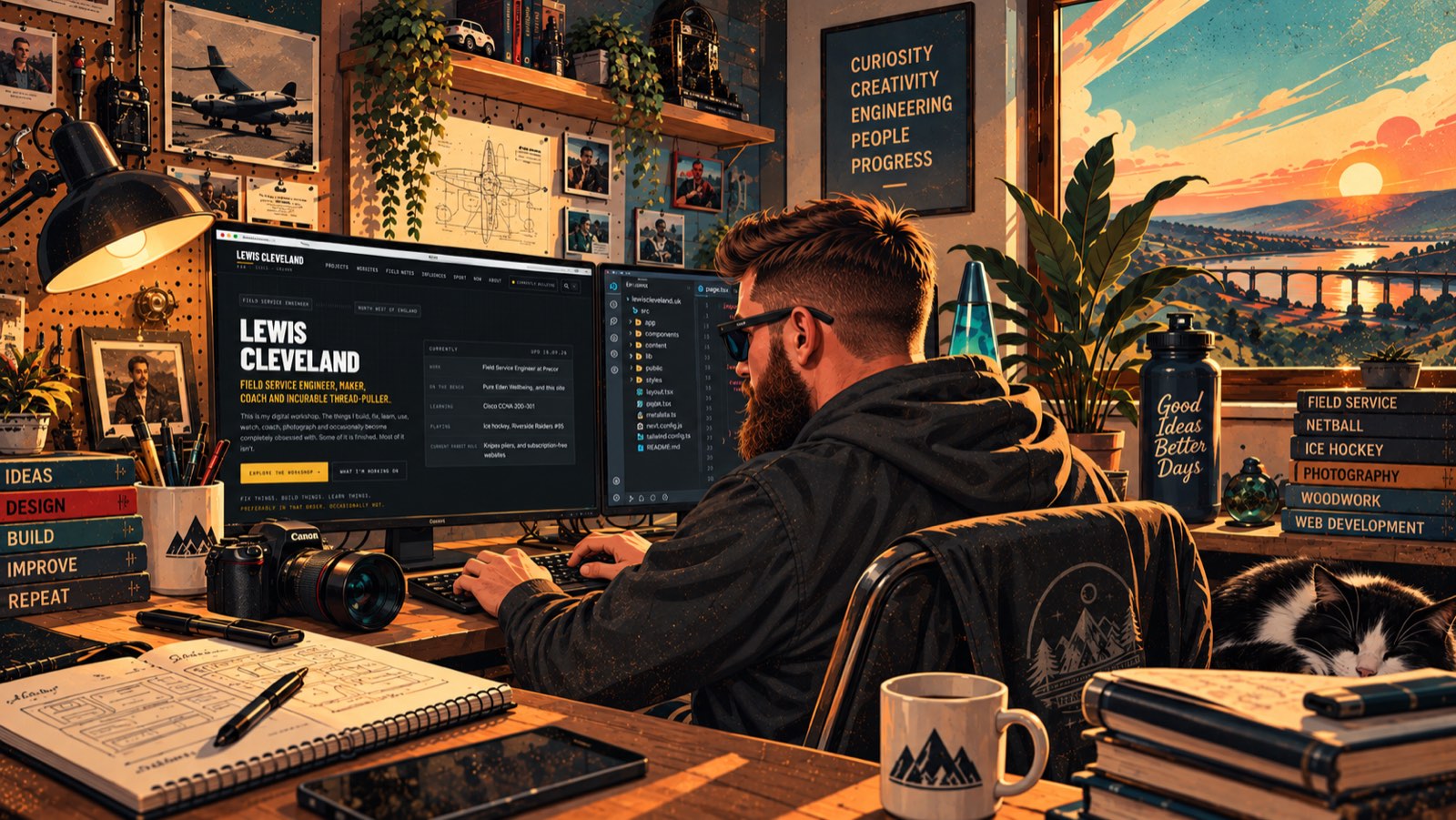
Apparently the website needed a page about building the website.
We're through the looking glass now.
In fairness, this is the project I have spent more time on than any other on here, and it would be slightly odd to write case studies about everybody else's websites while quietly pretending this one assembled itself.
01
Why I Built It
It was supposed to be a CV.
That was genuinely the plan. Somewhere to point people, tidier than a PDF, with a bit more personality than a job site profile.
It lasted about a week.
The problem with an online CV is that it describes a job. It does not describe what somebody is actually like, and it definitely does not explain why a field service engineer owns this many screwdrivers, coaches netball, plays ice hockey, is working through a networking certification and keeps building websites for people at weekends.
On a CV, that list looks like a lack of focus.
It isn't. It is one habit pointed at nine different things.
I didn't know how it worked, so I started pulling at the thread.
Once I stopped trying to make it look like a career and started letting it look like a workshop, it got considerably easier to build — and a lot more fun.
02
The Design Language
The look is mid-century retro-futurism, and it is not decoration bolted on at the end. It came first and everything else was built to fit inside it.
Cream, mustard, burnt orange, teal, faded blue and deep navy. Condensed display type over a plain, readable body face, with a monospace for the technical furniture. Painted gouache-style illustrations rather than stock photography. Status labels, equipment plates, drawing references, revision stamps, numbered sections — the visual vocabulary of a workshop manual rather than a marketing site.
Projects are numbered like job cards. Ideas are filed like slips in a drawer. Tools sit on shelves with a status against them. The Now page reads like a status board.
There are things it deliberately is not. It is not a 1950s diner. No chequerboard floors, no jukeboxes, no chrome for the sake of chrome, no Americana. That is fancy dress, and fancy dress is a different thing entirely from what I am after.
03
Why the 1950s?
This is the part people ask about, so it is worth answering properly.
Part of it is personal. My dad was born in the 1950s, so when I look at the machines, illustrations and ideas that came out of that decade, I am looking at the world his generation arrived into. That thread runs further back too — my grandpa spent his career in engineering, including work connected with aero engines, which is a story of its own.
But the bigger reason has nothing to do with the past.
What I love about the 1950s is their idea of the future.
Look at how the future was drawn during that period. Jet aircraft. Monorails. Atomic power. Cities in the sky. Cars with fins that looked like somebody had sketched a runway and then attached wheels. Some of those predictions were remarkably close. Most were completely bonkers.
The accuracy is beside the point. What gets me is the confidence behind them — a working assumption that problems existed in order to be solved, and that if something didn't exist yet, somebody would go and build it.
And they were doing it on drawing boards. Pencils, paper, slide rules, models, machining, testing, and a great deal of "well, that didn't work". Then another drawing. Another prototype. Another attempt.
That process hasn't actually changed. The tools have. The curiosity hasn't.
Retro-futurism lets me borrow that optimism without pretending the past was perfect. It lets me take the visual language of yesterday's tomorrow and point it at the things I'm actually building today.
04
The Digital Workshop
Once the metaphor arrived, the structure more or less designed itself.
Projects are the things on the bench. Field Notes are what gets written up afterwards. The Workshop holds the tools, with an honest verdict against each one. The Idea Drawer holds the slips of paper, including the ones that will never become anything. Now is the status board. Influences is the wall of people and machines that changed how I think about all of it.
The important part is that none of those are separate databases in a trench coat. A screwdriver review leads to the workshop. The workshop leads to a project. The project leads to a field note. The field note leads to my grandpa, or to a television programme, or to a man taking a motorcycle apart on the internet.
That wandering is the entire point. If somebody arrives here looking for one thing and leaves forty minutes later having read about something completely unrelated, the site has done its job.
05
How It Evolved
It has been rebuilt, rearranged and generally interfered with more times than I can remember.
It started as a fairly ordinary portfolio layout. Then the retro-futurist identity took over. Then the workshop metaphor arrived and the navigation got rewritten around it. Then the writing started, and it turned out there was a lot more of that in me than expected. Then the tool reviews appeared. Then the projects for other people started needing somewhere to live, so a Websites section went in.
Underneath, it is deliberately boring technology. A folder of Markdown files and a few JSON files for the structured content, a Python script that turns them into plain HTML, and no build tooling to speak of. No framework. No database. No cookies, no tracking, no newsletter.
That is not minimalism as a personality trait. It is because I wanted to be able to open this in three years and still understand it, and because a site made of static files loads quickly on a phone in a car park, which is where a fair amount of the internet is actually consumed.
06
What I've Learned
Writing is harder than building, and considerably more useful. Most of what is good on here came from being forced to explain something properly and discovering halfway through that I didn't understand it as well as I thought.
Constraints help. Having a fixed palette and a fixed component vocabulary means every new page takes an hour rather than a week, and the site stays coherent even when I am tinkering at eleven at night.
An unfinished thing on a page is more interesting than a polished thing. The projects people respond to are the ones where I have written down what broke.
And nothing kills a personal site faster than deciding it has to be finished before you are allowed to publish it.
07
What's Next
A proper tool inventory, which is the single biggest gap. Build logs on the projects that keep moving. More of the influences written up. And whatever I end up taking apart next.
There is no version where this is done.
Built in Cheshire. Probably modified since you last visited.
LOG THE SAWDUST
Build Log
Dated entries from the bench. The finished thing is only half the story.
- 18 SEPTEMBER 2026
The workshop wing
ADDED- An Influences collection, so the people and programmes that shaped the way I think stop being scattered across Field Notes.
- A Made for People collection for the club and small-business work.
- A colophon, a proper 404 and a Show Me Something button in the footer.
- Build logs. Including this one, which feels a bit like a snake eating its own tail.
CHANGED- The Idea Drawer stopped being empty. Eleven slips, most of which will stay in there.
- Now became a status board rather than a paragraph.
- The homepage counts itself instead of me writing numbers into a template.
WHAT I LEARNED- Writing the page about building the website forced me to explain the 1950s thing properly for the first time. It turned out to be the clearest thing on here.
- 18 SEPTEMBER 2026
An address, eventually
ADDED- An email address, which the site had deliberately gone without until now.
CHANGED- It never appears in the page source as one readable string. Each half is stored backwards and assembled in the browser, with a spelled-out version for anyone without scripts.
WHAT I LEARNED- There is no clever trick here that beats a determined scraper. There is only making yourself less convenient than the next site along.
- 18 SEPTEMBER 2026
A Websites section
ADDED- A /websites page, a nav item and a homepage block, so the web work is findable without the site turning into an agency.
CHANGED- The section curates the existing project pages rather than duplicating them. One case study, two doors into it.
- Link previews finally have an image. Every share before this was a grey rectangle.
WHAT WENT WRONG- First attempt created a second copy of every case study under a new URL. Two versions of the same writing, immediately drifting apart. Deleted before it could become a habit.
- 16 SEPTEMBER 2026
Following my grandpa's paper trail
ADDED- Actual sources on the article about my grandpa — conference papers from 1986 onwards, and his own company's records.
WHAT I LEARNED- Separating what I can document from what is family story was harder and far more interesting than writing the article in the first place.
- Four of the papers I found referenced, I could not verify a link for. They are listed as unlinked rather than quietly dropped.
- 15 SEPTEMBER 2026
Pictures that aren't 16:9
ADDED- An image_fit option, so a portrait book cover or a photographed sign shows the whole picture instead of being cropped to a letterbox.
WHAT I LEARNED- Every image system starts by assuming one aspect ratio and ends by regretting it.
- 13 SEPTEMBER 2026
The routing rules that did nothing
FIXED- Every rule now ends in a slash, plus one that doesn't, for the files with extensions that never get one.
WHAT WENT WRONG- Spent an evening adding routing rules that the host ignored completely. No error, no warning, just a 404 and a growing suspicion that I had misunderstood something basic.
- I had. With trailing slashes switched on, the host adds the slash and redirects before it ever looks at the rewrite rules. Every rule I had written was matching a URL that no longer existed by the time it was consulted.
WHAT I LEARNED- When something is being ignored rather than failing, the problem is almost always order of operations, not syntax.
- Deploying throwaway test routes to find out what the platform actually does was faster than another hour of reading documentation.
- 13 SEPTEMBER 2026
First build
ADDED- A static generator in Python, the content folders, the palette, the component vocabulary and the first handful of projects and notes.
- A domain, which made it real in the way that nothing else quite does.
WHAT I LEARNED- Building the component vocabulary before the pages was the best decision on the whole project. Everything since has been assembly.
RELATED FIELD NOTES
- Websites With a PersonalityWeb Development · 16.09.26
- The Future We Were PromisedThoughts · 18.09.26
RELATED PROJECTS
- The Wellness RoomPROJECT_006 · PROTOTYPE
- G&W NetballPROJECT_001 · ACTIVE