The Wellness Room by Danielle
Giving an independent wellness business a digital home with as much personality as the real thing.
- PROJECT ID
- PROJECT_006
- STATUS
- PROTOTYPE
- CATEGORY
- Small Business / Web & Apps / UX
- START
- —
- LAST UPDATED
- 16.09.26
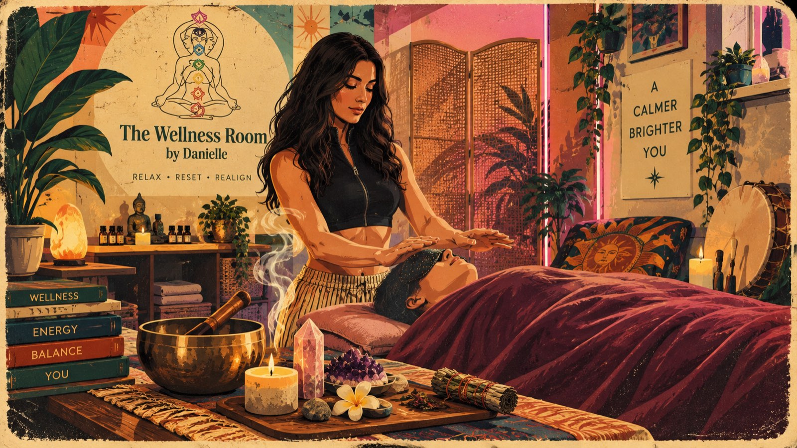
Giving an independent wellness business a digital home with as much personality as the real thing
Some website projects begin with technology.
This one began with a personality.
The Wellness Room by Danielle is an independent wellness business with a very distinct identity. It's spiritual, colourful, calming and personal, offering an experience that goes far beyond the generic image of a massage treatment room.
When I started looking at its existing online presence, I saw an opportunity to explore an idea I've become increasingly interested in:
Can a small business have a genuinely bespoke digital experience without losing its personality to a template or becoming dependent on an ever-growing collection of subscriptions?
The Wellness Room became my opportunity to find out.
01
The Project
The goal wasn't simply to redesign a website.
I wanted to create a digital home for the business.
Somewhere customers could discover Danielle, understand the treatments and experiences she offers, get a sense of what The Wellness Room actually feels like and easily take the next step when they're ready.
But there was another objective too.
I wanted the website to feel like Danielle's business, rather than a website that could belong to any wellness company.
That sounds obvious.
It isn't.
02
Escaping the Wellness Template
Search through wellness websites and you'll quickly discover a particular visual formula.
Muted beige. White towels. Pebbles. Bamboo. Minimal typography.
Maybe a leaf.
Probably several leaves.
There's nothing inherently wrong with that aesthetic, but The Wellness Room has far more character.
Danielle's actual space is filled with colour, plants, crystals, candles, sound bowls, spiritual imagery and warm lighting.
There are pinks and purples.
Natural textures.
Earthy materials.
A little bit of bohemian energy.
And Danielle herself is an enormous part of the identity of the business.
So rather than making the business fit a fashionable wellness aesthetic, I wanted the design to work the other way around.
03
Turning a Physical Space Into a Digital One
One of my favourite parts of the project was translating the atmosphere of The Wellness Room onto a screen.
I didn't want someone to visit a beautiful earthy website and then arrive at the real space to discover something completely different.
The two should belong together.
That meant looking closely at the actual environment.
The plants. The lighting. The colours. The textures. The spiritual elements. The treatment space.
Even the feeling created by Danielle's photographs and social content.
Those elements became inspiration for the visual direction of the site.
Rather than designing a fictional version of the business, I wanted to amplify the identity that was already there.
04
More Than Massage
Another important part of the project was understanding what The Wellness Room actually represents.
It would have been very easy to position it as another massage business.
But that wouldn't tell the whole story.
Danielle's approach incorporates a broader world of wellbeing and spiritual practices, and the website needed enough flexibility to communicate that without overwhelming somebody discovering the business for the first time.
That's an interesting UX problem.
A returning customer might know exactly what they want.
Someone else might arrive thinking:
"I know I need to switch off for a while, but I have absolutely no idea what I should book."
The website needs to work for both.
So the experience is designed around discovery as much as information.
05
Making Booking Feel Part of the Experience
One of the bigger ambitions for the project was creating a smoother journey between discovering a treatment and actually booking it.
I didn't want the website to suddenly feel like it had finished the moment someone clicked Book.
The booking experience should feel like a natural continuation of everything before it.
Simple.
Clear.
Mobile-friendly.
And importantly, unmistakably part of The Wellness Room.
That philosophy runs throughout the project.
Technology should support the experience rather than constantly reminding the customer that they're interacting with technology.
06
Thinking About Danielle's Experience Too
There's another customer in this project who isn't really a customer at all.
Danielle.
It's easy to obsess over what the public sees and forget about the person who actually has to run the business.
So I've also thought carefully about what happens on the other side.
How easily can the business manage its digital presence?
How much unnecessary administration can be removed?
What information actually matters day to day?
Can common tasks be made simpler?
Can everything feel like one coherent system rather than a collection of unrelated services held together with passwords and browser tabs?
The exact machinery behind that stays behind the curtain.
But designing for the business owner as well as the customer has become an important part of the project.
07
Challenging the Subscription Model
This project also became part of a wider experiment I'm conducting with small-business websites.
I'm fascinated by how many recurring costs can gradually accumulate around a relatively small company.
- The website.
- Booking.
- Marketing.
- Customer management.
- Forms.
- Analytics.
- Additional features.
Each platform might only charge a modest amount, but eventually the business has assembled a small army of monthly direct debits.
I'm not trying to eliminate every subscription.
Some services absolutely earn their cost.
Instead, I'm asking a much simpler question:
Does the business actually need to pay for this?
If a service provides genuine value, great.
If the same requirement can be solved more simply, I'd rather investigate that.
The objective is sensible digital ownership, not avoiding costs at all costs.
08
Designing for a Small Business, Not a Small Corporation
This distinction has become increasingly important to me.
A small business doesn't need a miniature corporate website.
Its size can actually be one of its greatest strengths.
The person customers see on the website can be the same person who greets them when they arrive.
The language can have character.
The design can take risks.
The story can be personal.
The experience can reflect the individual behind the business.
That's difficult for a huge corporation.
For an independent business, it's an advantage.
The Wellness Room doesn't need to look enormous.
It needs to look like Danielle.
09
A Real Project, Not a Design Exercise
That's also what makes this project valuable to me personally.
This isn't a fictional company invented so I can put a nice screenshot in my portfolio.
It's a real business.
With real customers. Real treatments. Real requirements. Real constraints.
And a real person who eventually has to use what I've built.
That changes how you think.
Something that looks beautiful but confuses customers isn't successful.
Something technically impressive that makes running the business harder isn't successful either.
The finished product needs to earn its place.
10
The Interesting Part Is the Decisions
Modern development tools have played an important role in allowing me to explore projects like this.
They've dramatically increased the scale of what I can experiment with as an individual.
But I've also discovered that the interesting part isn't simply writing code.
It's making decisions.
Understanding the business.
Researching the market.
Finding the visual identity.
Planning journeys.
Questioning features.
Testing ideas.
Removing things.
Changing direction.
And occasionally staring at something you've spent hours building and deciding:
Nope. That's rubbish. Start again.
Good tools can help you build incredibly quickly.
11
What This Project Has Taught Me
The Wellness Room has reinforced something I'm beginning to believe quite strongly:
A good small-business website shouldn't begin with the website.
Begin with the business.
Understand the person behind it.
Understand the customers.
Understand the physical experience.
Understand what makes it different.
Then decide what the digital version should become.
Sometimes that might result in something beautifully simple.
Sometimes, as happened here, the project grows into something considerably more ambitious.
Either way, the technology comes second.
12
Giving Small Businesses Their Personality Back
That's ultimately why The Wellness Room has become an important project for me.
It's not simply another website I've built.
It's part of a bigger question I'm exploring:
What happens when we stop forcing small businesses into generic digital templates and start designing around the businesses themselves?
The Wellness Room by Danielle should feel warm.
Personal.
Spiritual.
A little unconventional.
Calm without being sterile.
Professional without becoming corporate.
And unmistakably hers.
At the same time, I'm exploring how modern development tools can give small businesses greater control over their digital presence without automatically signing them up for another lifetime of unnecessary monthly payments.
There's still plenty I want to explore.
That's part of the fun.
But the principle behind the project is already remarkably simple:
That's what The Wellness Room project is really about.
RELATED FIELD NOTES
- Websites With a PersonalityWeb Development · 16.09.26
RELATED PROJECTS
- Inner BeautyPROJECT_005 · PROTOTYPE