Pure Eden Wellbeing
A second independent wellbeing business, and a proper test of what actually transfers between two projects in the same sector.
- PROJECT ID
- PROJECT_007
- STATUS
- BUILDING
- CATEGORY
- Small Business / Web & Apps / Identity
- START
- —
- LAST UPDATED
- 18.09.26
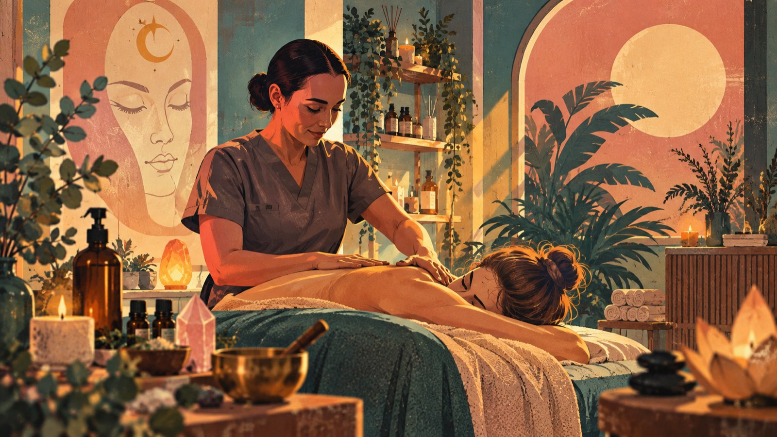
Not long after The Wellness Room by Danielle, a second independent wellbeing business came along.
Which immediately created a slightly uncomfortable question.
I had just spent weeks arguing that small business websites all look the same, that templates flatten personality, and that a website should look like the business rather than like the person who built it.
So what happens when the next project is, on paper, the same kind of business?
The lazy answer is obvious. I already have a wellness website. Change the colours, swap the treatments, change the name at the top.
Nobody would notice.
Except I would, and so would both owners, and eventually so would anybody who looked at the two sites side by side.
01
What Actually Transfers
Having now done two of these back to back, I have a much clearer answer than I did at the start, and it is not the one I expected.
The architecture transfers. Almost all of it. The way bookings are stored, the way availability is worked out, the shape of the admin area, the approach to sending emails, the migration setup — that is all method, and method should absolutely be reused. Rebuilding it from scratch for every client would be slow, expensive and worse, because the second version of anything is better than the first.
The design transfers not at all.
That distinction sounds obvious written down. It is much less obvious at eleven at night when you have a working thing on one screen and a blank folder on the other.
Adapt the engine. Never adapt the identity.
02
Two Businesses, One Sector, Two Atmospheres
Put Pure Eden and The Wellness Room next to each other and the surface similarities are real. Both are independent. Both are small. Both run almost entirely on the personality and reputation of the person doing the treatments. Both need somebody to find a treatment, understand what it involves, and book it without a fight.
Underneath, they are nothing alike.
The Wellness Room is warm, colourful and a little bohemian. Plants, crystals, candles, sound bowls, pinks and purples. Being in it feels like being welcomed into somebody's home.
Pure Eden reads completely differently. The identity is quieter and more composed — a deep green on sage, a flowing script paired with a proper serif, and two fine-line butterflies that do a lot of work with very few strokes. There is space in it. It is calm rather than cosy.
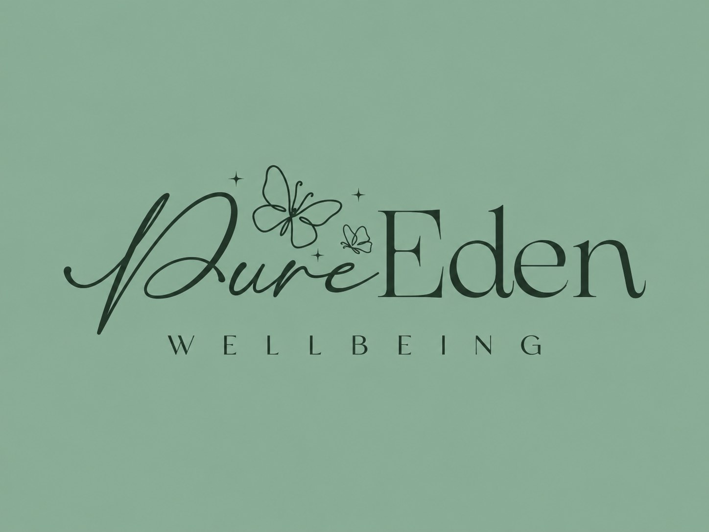
There was a useful starting point here that a lot of projects do not get: a properly designed logo. That mark answers a lot of questions before you start. It sets the palette. It sets the typographic mood — a script for warmth, a serif for credibility, neither of them shouting. It demands whitespace, because it falls apart when crowded. And its fine-lined butterflies establish that the visual language is drawn, not photographic and stocky.
03
The Idea: Two Rooms of the Same House
The concept I settled on is that the site should feel like entering a hidden sanctuary, and that the sanctuary has two rooms.
The garden room is the default. Cream, linen and sage, with filtered-sunlight leaf shadows falling across the page, a paper grain underneath everything, and arch shapes borrowed from doorways. It is where the massage and bodywork treatments live. It feels like late afternoon.
The inner room is for the spiritual pages and sections. Deep forest green, cream type, a trace of gold, faint constellation lines and a barely-there sacred-geometry watermark. Same house, different door.
Being able to move between those two moods matters more than it might sound, because the treatment menu genuinely spans both. Somebody booking a massage and somebody booking an energy treatment are often the same person in different weeks, but they are not in the same frame of mind when they arrive at the page.
The typography follows the same logic. A display serif that only ever gets used for display. A plain, friendly sans for anything you actually read or tap. And a handwritten face for small asides, used sparingly enough that it still feels like somebody wrote it rather than typeset it.
04
The Part I Care About Most: Not Making Claims
This is the section I did not expect to be the most interesting part of the project, and it comfortably is.
A wellbeing menu is a minefield. Some of these treatments have real, well-understood effects. Some are complementary practices that people find genuinely valuable and that no one should be pretending are medicine. The temptation — everywhere on the internet — is to blur that line, because blurred lines sell.
I did not want to write a single word I would be uncomfortable defending.
So the copy describes every treatment in terms of the experience and why somebody might choose it, and never in terms of what it will do to your body. Lymphatic drainage is not described as a detox or a weight-loss treatment. Fire cupping explains that the flame never touches the skin, and says plainly who it is not suitable for. The energy and spiritual practices are presented as belief-based and complementary, with no claims attached. Guided visualisation sessions say outright that they prove nothing and are not therapy.
Every treatment lists its contraindications and points people towards their GP where that is the right answer.
And the treatment finder — a short set of questions that helps somebody work out where to start — is clearly labelled as a discovery tool, not a diagnosis. Because the moment a quiz on a wellness website starts feeling like a diagnosis, you have built something you should not have built.
That standard is now written into the project's own documentation, so it survives me forgetting about it in six months.
05
Saying "To Be Confirmed" Out Loud
A lot of a small business project is waiting for information. Opening hours, policies, photographs, qualifications, the exact wording of a cancellation policy.
The usual approach is to write something plausible and quietly hope nobody checks.
Instead, anything not yet confirmed by the business renders as a dashed "To be confirmed" pill, right there on the page. It looks deliberate because it is. It is honest with visitors, it is a live checklist for the owner, and it makes it completely impossible for me to accidentally invent a fact and forget I did it.
Which is, more or less, the same habit that runs through this website. Unfinished and labelled beats finished and made up.
06
Mobile Is Not the Small Version
Nearly all of this traffic is a phone. Not a desktop design politely shrunk, but a phone as the actual design target.
There is a fixed action bar at the bottom of the screen on mobile — contact, directions, book — because those are the three things somebody standing outside a treatment room actually wants. Touch targets are at least 44 pixels. Treatment pages do not need six scrolls to reach the price.
Designing on a big screen and checking it on a small one produces a site that works. Designing for the small one produces a site that feels right.
07
Accessibility, Checked Rather Than Assumed
I keep saying on here that the aesthetic never gets to win an argument with usability, so it seemed reasonable to actually measure it.
Every public page was scanned against WCAG 2 A and AA, plus best-practice rules, at both phone and desktop widths. Zero violations across eighteen pages. Colour contrast ratios are recorded in the stylesheet itself rather than eyeballed.
Beyond the automated pass: a skip link, visible focus rings, Escape closes the mobile menu, focus moves correctly between the steps of the treatment finder, and the before-and-after comparison slider is a native range input rather than a clever draggable thing that keyboard users cannot operate.
Motion respects prefers-reduced-motion, and the reveal animations never hide content from anybody without JavaScript — which is the failure mode that quietly breaks an enormous number of otherwise nice websites.
08 CURRENT STATE
Where It Is Now
Honest state of play, because it would be easy to write this page as though it were finished.
Built: the public site — home, treatments, individual treatment pages, the spiritual section, the treatment finder, first visit, journal, gift vouchers, about, contact and privacy. Fourteen routes, the full treatment menu, the two-room design system, the accessibility work.
In progress: turning it from a website into a booking and client platform, with a proper database behind it. The audit, the architecture and the data layer are done.
Not done: it is not live. There is no domain yet, the booking system is not connected, and a good part of the business information is still sitting behind those "to be confirmed" pills.
Deliberately not decided by me: anything involving client health information or consent. Reviews and before-and-after images only go on with written permission, and that is the owner's call, not mine.
09 FUTURE THINKING
What I'd Do Next
Connect the booking flow, get the outstanding business details confirmed, and replace the labelled placeholder images with real photography of the actual room.
After that, the genuinely interesting question is whether the shared foundation underneath this and The Wellness Room is stable enough to be a proper starting point for the next one — so that the third independent business gets a week of design work instead of a month of plumbing.
That would be a good outcome. It is also exactly the point at which somebody normally builds a template and starts telling themselves it is bespoke, so I will be watching myself carefully.
RELATED FIELD NOTES
- Websites With a PersonalityWeb Development · 16.09.26
RELATED PROJECTS
- The Wellness RoomPROJECT_006 · PROTOTYPE
- Inner BeautyPROJECT_005 · PROTOTYPE