Riverside Raiders IHC
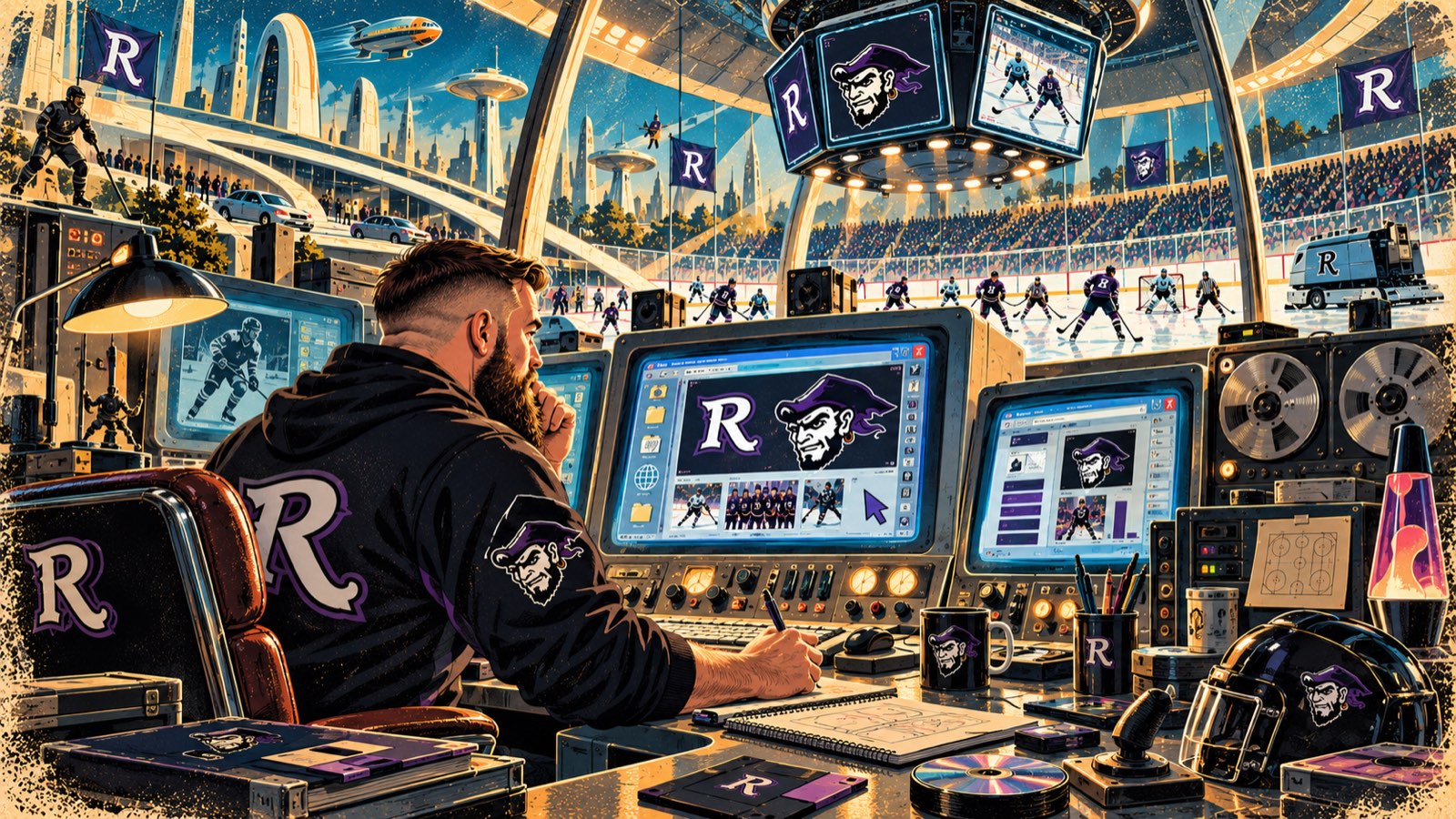
A beer-league hockey site built as though you have found an old computer and the Raiders operating system is still running.
- PROJECT ID
- PROJECT_002
- STATUS
- ACTIVE
- CATEGORY
- Ice Hockey / Web / Branding / Content
- START
- —
- LAST UPDATED
- 12.09.26
- LIVE SITE
- raidersihc.co.uk
Web Design · Development · Branding · Content · UX
Some websites are supposed to look polished, minimalist and extremely modern.
This one absolutely wasn't.
When I started working on the digital presence for Riverside Raiders Ice Hockey Club, I wanted the website to have the same personality as the team itself.
Ice hockey. Friends. Beer-league culture. Terrible jokes. Big personalities. And absolutely no reason whatsoever for the website to behave like it belongs to a multinational corporation.
So instead of asking:
How do we build a modern sports website?
I asked:
What if the Riverside Raiders had built their website when dial-up internet was still considered impressive?
And that's where things got wonderfully weird.
01
Welcome Back to the Internet
The design of raidersihc.co.uk deliberately borrows from the early web.
Think Windows 98, CRT monitors, desktop applications, chunky interfaces and the slightly chaotic optimism of the late 1990s and early 2000s internet.
Rather than hiding those influences, I made them the identity of the site.
The result isn't retro styling sprinkled onto a conventional website.
The website itself is supposed to feel like you've discovered an old computer somewhere, switched it on and found the Riverside Raiders operating system still running.
🖥️ RAIDERS.EXE has entered the chat.
02
A Website That Actually Belongs to the Team
One of the things I wanted to avoid was the generic sports-club template.
Change the logo.
Change the colours.
Upload a team photograph.
Done.
That might technically create a website, but it doesn't necessarily create an identity.
Riverside Raiders already had something far more useful: personality.
So the challenge became translating that personality into a digital experience.
The graphics, language, navigation and content could all be slightly unconventional because that's exactly what makes the site memorable.
It doesn't need to look like every other hockey club.
It needs to look like Riverside Raiders.
03
Hockey Without Pretending We're the NHL
There's another important part of the project.
This is recreational ice hockey.
And that's something worth celebrating rather than disguising.
The website doesn't need dramatic corporate language pretending every game is Game Seven of the Stanley Cup Final.
The people involved play because they love hockey.
There's competition.
There's development.
There's camaraderie.
There are rivalries.
There are undoubtedly questionable decisions.
And occasionally somebody remembers how expensive ice hockey actually is.
The site can embrace all of that.
It gives me much more freedom to write content that sounds like actual hockey people talking to other hockey people.
04
Making Players Part of the Identity
The players aren't simply names buried inside a team list.
They're characters within the wider Raiders world.
That's led into some of my favourite creative work around the project, including retro player graphics, Panini-inspired cards and stickers, training graphics and deliberately nostalgic promotional material.
Rather than forcing everything into one rigid visual style, the wider Raiders identity can borrow from different periods of popular culture.
1990s computer interfaces. Early internet graphics. Old software packaging. Trading cards. Infomercials. Sports memorabilia.
The common thread isn't a particular design template.
It's nostalgia.
05
Sponsorship Without the Corporate Beige
That philosophy has even influenced how I've approached sponsorship.
Instead of the standard Bronze · Silver · Gold · Platinum, I've explored sponsorship packages inspired by the technology behind the site's identity:
- Floppy Disk
- CD-ROM
- Windows 98 Pro
- NT Server
It's a tiny detail.
But those details build personality.
A local business considering supporting a recreational hockey team doesn't necessarily need another corporate sponsorship brochure.
Give them something they'll actually remember.
06
Building Something People Want to Explore
Modern UX usually tries to remove every possible obstacle between a visitor and their destination.
That's generally sensible.
But there's also something we've lost from the old internet.
Exploration.
Websites used to be places.
You clicked things because you wondered what would happen.
You found strange pages.
You discovered little details.
You felt like somebody had actually made the thing.
I wanted some of that feeling back.
The trick is doing it without recreating everything that was genuinely terrible about old websites.
So underneath the retro presentation, the site still needs modern foundations.
It should work properly on a phone.
Navigation should make sense.
Information should be accessible.
Pages should load properly.
People should be able to find what they're looking for.
07
Two Things I Love Colliding
This project sits in a particularly enjoyable corner of my portfolio because it combines two things that are genuinely part of my life.
Technology and ice hockey.
I'm not designing a hypothetical hockey brand for a fictional portfolio project.
I'm involved with the team.
I understand the culture I'm trying to represent.
That changes the way I approach the design.
The little references aren't there because somebody wrote "make it retro" in a brief.
They're there because they make us laugh.
And if somebody visits the site and thinks:
What on earth is this?
followed shortly afterwards by:
Actually, this is brilliant.
Then it's probably doing its job.
08
More Than the Website
The interesting part is that the website can become the centre of a much wider Raiders identity.
Social graphics can borrow from it.
Player announcements can borrow from it.
Game promotions can borrow from it.
Sponsorship material can borrow from it.
Merchandise can borrow from it.
Player cards can borrow from it.
Even the language we use can belong to the same strange little digital universe.
That means I'm not simply building pages.
I'm gradually building a visual and digital world around the team.
And that's considerably more fun.
09
Built for Hockey. Powered by Nostalgia.
raidersihc.co.uk is deliberately different from the G&W project.
G&W is about creating a sophisticated digital system that quietly helps a large community sports club operate.
Raiders is allowed to be something else.
Louder. Stranger. More nostalgic.
It's a playground for web design, graphic design, branding and hockey culture.
It also demonstrates something I think is important when designing anything:
Not every project needs the same answer.
Understand who it's for.
Understand its personality.
Then build something that actually belongs to it.
Insert floppy disk.
Load RAIDERS.EXE.
Go play hockey.RELATED PROJECTS
- G&W NetballPROJECT_001 · ACTIVE